A charity fundraising platform with two paths: one built for a donor to give without friction, one making an organizer’s campaign impossible to doubt.
UnityPath is a charity fundraising platform with two paths, one built for donors who need speed, one built for organizers who need proof.
Project scope
End-to-end responsive web platform
Role
UX/UI designer and researcher
Year
2025
Duration
4 months (Sep–Dec 2025)
Donor
Chloe, an emergency donor
Problem
When a disaster hits, Chloe wants to give without friction. Most platforms hide the fee until she is already at checkout, and put an account wall in front of her first. She is not unusual for giving up: across the sector, only 11% of desktop visitors and 8% of mobile visitors who reach a donation page actually complete the gift.
Solved by
The fee shown as a real dollar amount before she pays, then broken down line by line: what reaches the campaign, what covers processing, what the platform keeps. She can cover the fee herself so the full amount goes through. Guest checkout, no account required. A one-tap monthly toggle.
Benefit
She gives without friction and knows exactly where her money goes. The platform keeps more of the donors who start, and the monthly toggle targets the segment that already drives 27% of all online giving revenue.
The guest donation flow
Organizer
Kevin, a grassroots organizer
Problem
Kevin is asking parents and school administrators to trust him with their money, but he’s not a registered charity, so most platforms have no way to vouch for him. A one-time badge wouldn’t fix it either. In a 2025 study of donor perceptions, trust explained roughly 66% of how donors judged an organization’s performance, while financial transparency on its own explained roughly 12%.
Solved by
Identity verification unlocks a public Verified badge next to live, checkable proof: real-time funds raised, donor count, a running updates feed he posts to, and a direct way for a donor to message him.
Benefit
Donors get something checkable instead of a logo to trust: live totals, a running record of where the money went, and an organizer who answers. Kevin proves himself without nonprofit status, and the platform opens up to a much larger pool of organizers who couldn’t get verified on many other websites.
Where the numbers come from: Donation page completion rates (11% desktop, 8% mobile) and monthly giving’s 27% share of online revenue: M+R Benchmarks 2026, reporting on 2025 data across 200+ nonprofits. · Trust vs. transparency in donor perceptions (66% / 12%): Ghoorah, Mariyani-Squire & Amin, “Relationships between financial transparency, trust, and performance: an examination of donors’ perceptions,” Humanities and Social Sciences Communications, vol. 12, article 315 (2025), structural equation modelling of 400 survey responses.
Research
What the competitors get wrong
The two problems above didn’t start as a headline. This is the research, and the one wrong assumption, that surfaced them.
Two specific weaknesses shaped where UnityPath needed to be different.
GoFundMe
Fees are hidden behind an optional tip and contribution prompt at checkout, not shown as a clear number before you commit to giving.
JustGiving
Verification is tied to registered charity status, so a grassroots or first-time organizer has no way to prove legitimacy at all.
What I learned from research
I researched donor and organizer behavior through interviews and secondary research, then synthesized the findings into five donor and organizer archetypes, and focused the design on the two most distinct: an emergency donor and an institutional organizer.
5Archetypes synthesized
2Primary personas designed for
4Core pain points surfaced
Where the research and interviews disagreed
The study behind that 66% figure says trust is most of the story: donors judge a charity far more on whether they trust it than on anything it discloses. I expected my own interviews to say the same thing. They didn’t. Urgent donors would abandon a cause they already trusted if the flow felt slow, while organizers were the opposite, willing to spend real time on a process if it helped them prove credibility.
Both are true once you separate the moments.
Define
Personas
Two personas anchored the work, already introduced above by the problems they face.
Ideate
Resolving conflicting requirements
A different kind of conflict from the problems above: three moments where a specific business request worked against what Chloe or Kevin needed, and how each got resolved.
Automatic sharing
The client wanted sharing to happen automatically after every donation. Users valued their privacy.
✔ Sharing stays optional, prompted but never automatic.
Email capture
The client wanted every donor’s email captured. Donors resist extra steps mid-checkout.
✔ Newsletter opt-in moved to the confirmation page, after giving.
The admin fee
A 15% admin fee is necessary on most campaigns. Users distrust hidden costs.
✔ Fee shown at category selection, and again before payment.
Design decisions
Designing for when the trust breaks
If the whole promise is continuous proof, the design needs an answer for what happens when the proof stops. These are the two states most case studies skip.
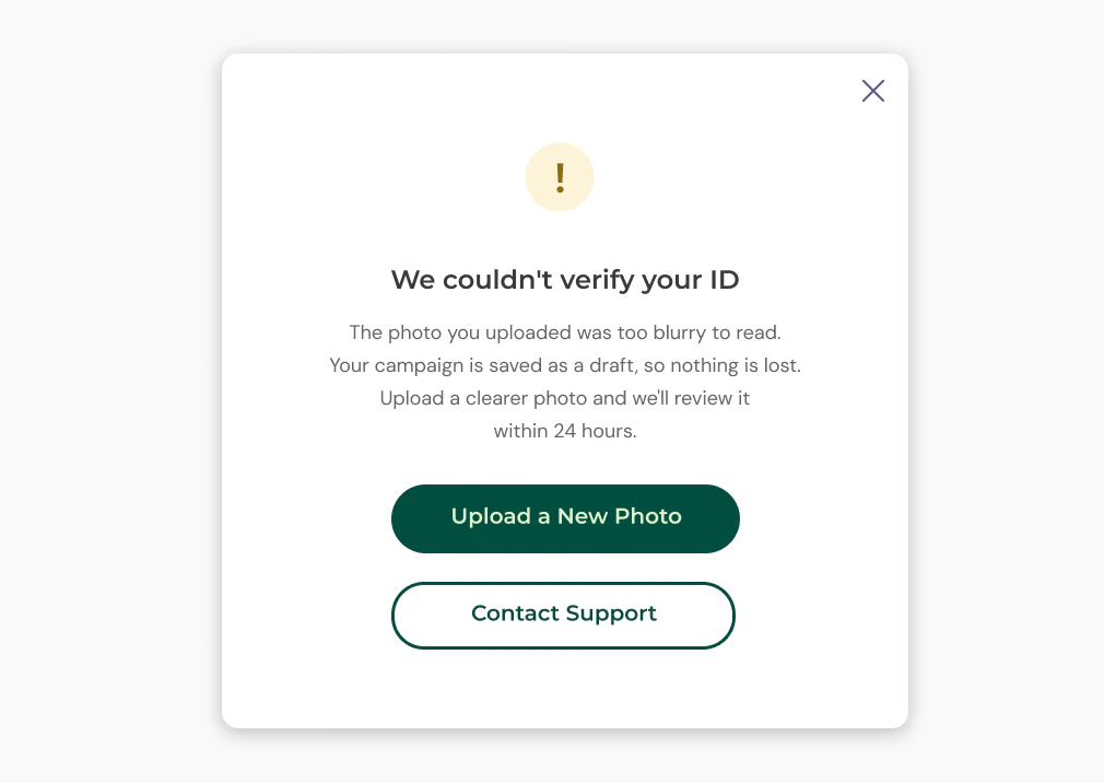
When verification is rejected
My user flow had a rejection branch in it from the start, and like most portfolios I had only ever designed the success path. So I designed the rejection: it names the actual reason, confirms the campaign is saved as a draft so nothing is lost, sets a 24-hour expectation, and gives one obvious way forward. A dead end here doesn’t just lose a campaign, it loses the organizer permanently.
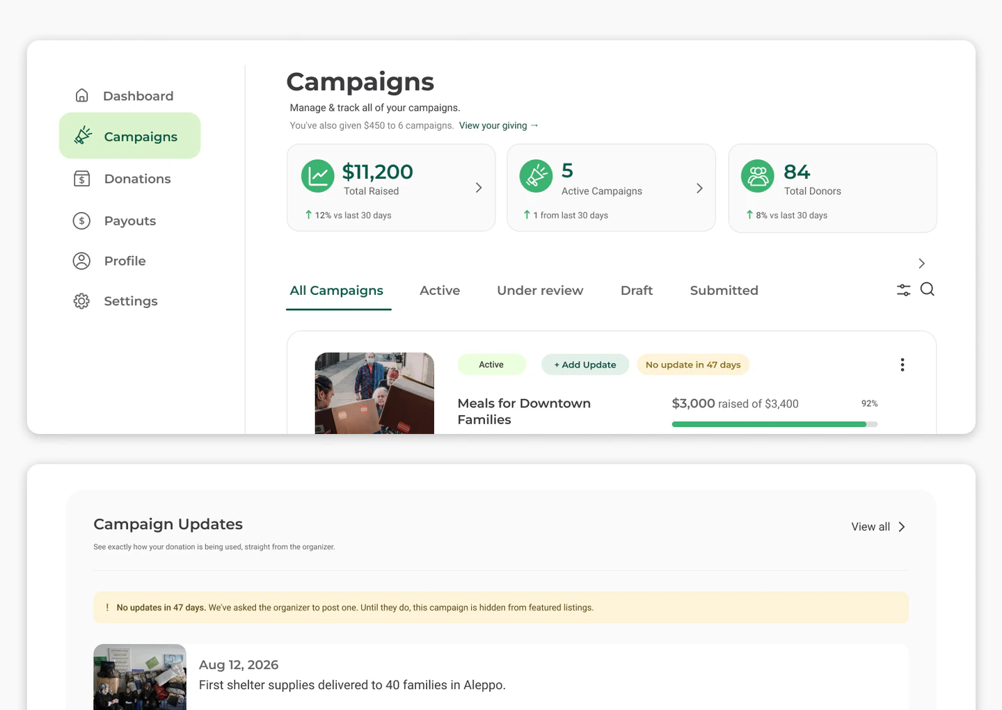
When a campaign goes quiet
If updates are the proof, then silence is information, and hiding it would break the same promise the platform is selling. So the platform surfaces it. Donors see “No updates in 47 days” on the campaign itself, and it drops out of featured listings until the organizer posts. The organizer sees the same count on their dashboard first, so it is a nudge before it is a penalty.
Ideate
Working out the structure
I mapped two core flows before wireframing (guest donation and campaign submission), defining key decisions, checks, approvals and handoffs.
User flows. Click to zoom and scroll.
I built the sitemap around top navigation and hover menus, mapping four main sections across four levels, from global navigation to dashboard sub-pages, with dynamic pages marked separately.
I sketched key screens on paper to test structure and clarity, then moved the strongest layouts into Figma as mid-fidelity wireframes to refine hierarchy and flow across both user paths.
Prototype
Lo-fi flows
I connected the mid-fidelity wireframes into an interactive prototype, testing both paths end to end before visual design. This enabled structured usability testing with real interactions.
Donation flowCampaign flow
Test
Usability testing
I tested the mid-fidelity prototype across both user paths to surface friction points before moving into visual design. Keeping tests at this stage meant feedback stayed focused on structure and navigation rather than appearance.
5Participants (donors and organizers)
RemoteUnmoderated sessions
30 minPer session
4Key friction points fixed
Each finding led to a focused change that made the experience clearer and more reassuring. Here are the four improvements that came directly from testing.
Design
Final design
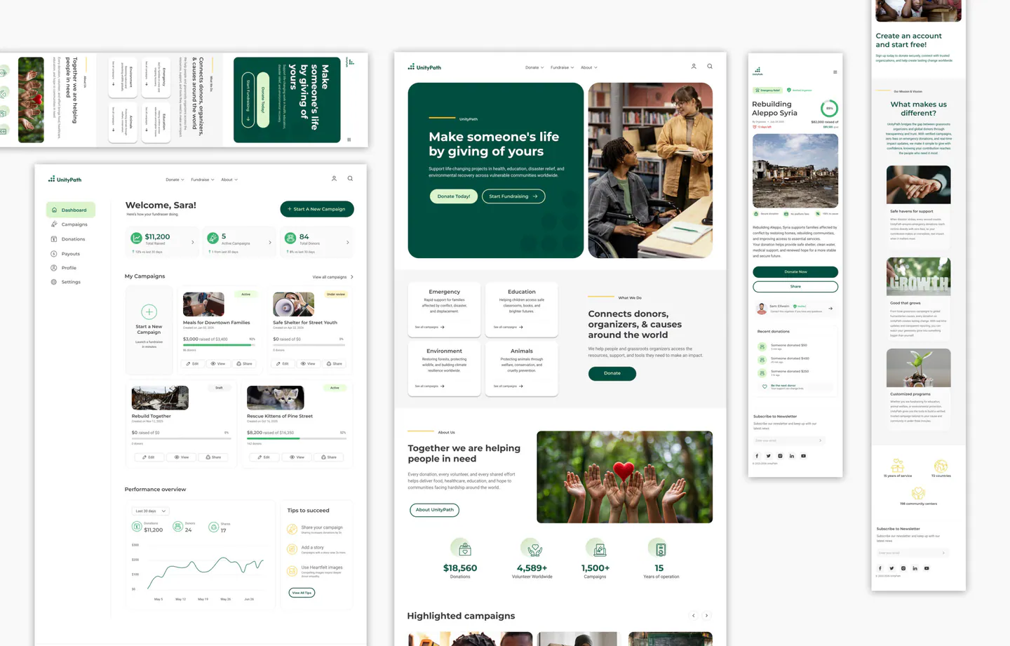
Research, user flows and testing come together in the final design. Here are a few screens that capture the platform.
See the full experience in the working prototype, from browsing and donating as a guest to launching and managing a campaign.
Donation flowCampaign flow
Reflection
What both sides get
The problems above weren’t just user problems. Solving them pays off for the business too.
Donors
Giving without friction, with the fee and destination shown before they pay. And after they give, a running record of what the money actually did.
Organizers
A way to prove, continuously, that the money is being used the way they said, without needing formal nonprofit status to do it.
Business
Less abandoned checkout, more repeat and monthly donors, and a wider base of organizers who can now raise credibly on the platform: three things that compound into more completed donations and more fee revenue over time.
Measure
What I’d measure
What I’d watch, and what would tell me I was wrong.
Donation page completion rate
Against the 11% desktop and 8% mobile sector baseline. Guest checkout and fee transparency should improve the two biggest donor pain points.
Monthly giving conversion
Monthly already drives 27% of online giving revenue, which makes a single toggle the highest-leverage control on the page.
Verified individuals and funds
If verified individual organizers raise far less than registered charities, the case for opening verification to individuals falls apart.
Updates and funds raised
If campaigns with regular updates don’t raise more, the core premise of continuous proof needs rethinking.
Next
Next steps
Test the high-fidelity designs in a second usability round, including the new update-posting and messaging flows.
Build out the Charity Advisor flow for legacy and bequest donors.