A running coach on the wrist that keeps runners on pace, and safe, at a glance.
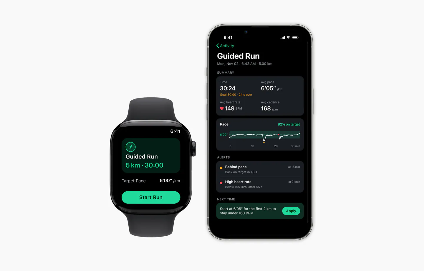
Guided Run is a design challenge for a consumer fitness product: a guided 5K run across a smartwatch and its companion phone app. The runner sets a goal on the phone, runs with the watch, and reviews the run afterwards.
Every live screen answers one question first: am I on pace?
Set up on the phoneRun with the watchReview on the phone
The challenge
Designing for a two-second glance
The brief asked for a guided 5K run that tracks pace, heart rate, cadence, time and distance, and steps in when the runner falls behind their target pace or their heart rate gets too high. The hard part isn’t the data. It’s that the runner is moving, sweating and looking at a small screen for a second or two at a time.
208 × 248Apple Watch screen (46 mm), in points
1–2 sA typical glance while running
5Live metrics to show
2Situations that need an alert
Framing
Four questions that shaped the work
01
What must the runner see first?
Out of five numbers, only one can be the biggest.
02
When should the watch interrupt?
Too few alerts and it isn’t coaching. Too many and runners stop listening.
03
Watch or phone?
What belongs on the wrist mid-run, and what can wait for a bigger screen.
04
Does it work while moving?
Small targets, color-only signals and tiny text all fail on the run.
Priorities
What comes first
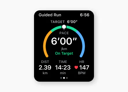
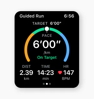
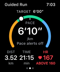
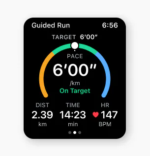
Pace is the biggest number. The brief is about target pace, and pace is the only number the runner can change during the run. Time and distance only show progress.
The ring reads at a glance. Green is on target, amber is slower, blue is faster. The knob shows where the runner is, so the answer doesn’t depend on reading digits.
Heart rate is always visible. It sits in the metrics row and only takes over the screen when it’s too high.
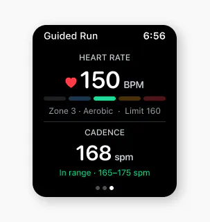
Cadence is tracked, but never vibrates. It lives on a second watch page and in the phone review.
Watch first
Designing for a small screen
The watch handles the whole run, so the phone isn’t needed until setup and review, where there’s room to read. On a 208-point screen, the main page shows only what matters and the rest is one swipe away. Runners don’t have to scan mid-run: the ring answers “am I on target?” at a glance, and a vibration flags anything that needs attention. These patterns (swipe pages, one focal number, self-closing alerts) carry over to other smartwatches.
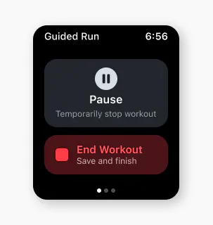
Swipe right: pause or end the runMain page: pace, distance, time, heart rateSwipe left: heart rate zone and cadence
16 ptSide margins, so nothing touches the curved screen edge
4 ptSpacing grid, since 8 pt steps were too coarse for this width
12 ptSmallest text anywhere on the watch
3Metrics per row at most, with one focal number per screen
Alert system
When the watch should speak up
The two alerts carry different weight, so they look and feel different. Falling behind is a coaching moment. A high heart rate is a safety moment.
Coaching
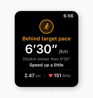
Pace alert
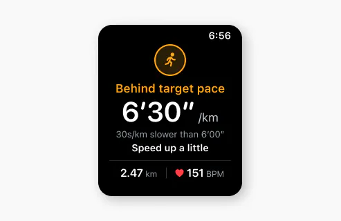
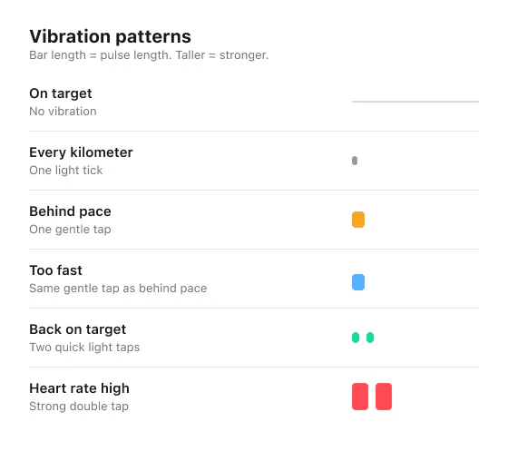
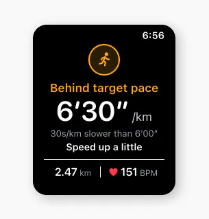
Trigger: slower than the target band for 20 seconds Feels: one gentle tap Runner sees: a calm amber notice with the pace, how far behind, and what to do Then: hides after 4 seconds; the pace stays amber until they’re back on target
Safety
Heart rate alert
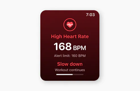
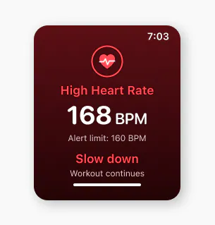
Trigger: above the heart rate limit for 15 seconds Feels: a strong double tap Runner sees: a red full screen with one instruction: slow down Then: returns after 4 seconds; heart rate stays red until it drops below 155
20 sWait before a pace alert, so short dips and GPS noise are ignored
15 sWait before a heart rate alert, shorter because it’s about safety
4 sOn screen, then the alert closes by itself, no tap needed
3 minMinimum gap before a pace alert can start again
Safety beats performance
Never “slow down” and “speed up” at the same time
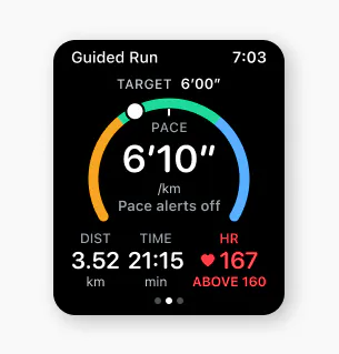
While heart rate is above the limit, pace alerts switch off and the screen says so. The runner can ease off without the watch also telling them they’re behind. Heart rate stays red until it’s safe, then everything returns to normal.
Feel it, hear it, then glance
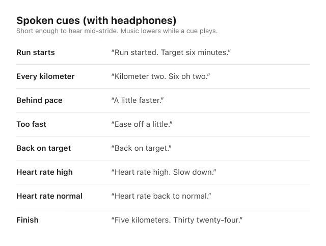
Each alert also has a vibration and a short spoken cue for runners wearing headphones, so they know what happened before deciding whether to look. A cue plays only when its alert would fire, and while heart rate is high, pace cues stay silent. Without headphones, vibration alone carries the message.
Haptic patternsAudio cues
Design decision
Resolving the edge cases
The rules above work on a smooth run. These are the moments where a simple rule would have annoyed or misled the runner.
Stopping at a traffic light
A runner waiting at a red light isn’t falling behind, but a simple rule would buzz them every time.
✔ The run pauses on its own and resumes when they start running again. Pace alerts only apply while moving.
Hovering near the limit
A runner going 6′14″, 6′16″, 6′14″ could get alert after alert in a few minutes.
✔ They only count as recovered at 6′10″ or faster, and a new pace alert waits at least 3 minutes.
Running faster than target
First version: blue on screen with no vibration, so every vibration stays meaningful.
✔ After research: most running watches warn in both directions, and starting too fast is a common 5K mistake, so it now gets the same gentle tap as falling behind, plus “Ease off a little.”
Iterations
What I tried and changed
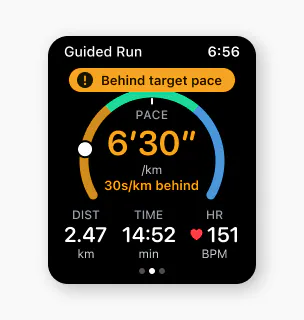
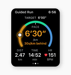
I explored four ways to show the pace alert. A banner looked like an error, a title swap was easy to miss, and a pulsing ring felt stressful. The calm notice won.
A
Solid banner
Clear, but it covers the ring and feels like an error.
B
Title swap
Calm, but small and easy to miss.
C
Pulse
Hard to miss, but a pulsing screen felt stressful mid-run.
D · Chosen
Calm notice
Names the cause calmly, then closes on its own after 4 seconds.
Phone setup
From pace to goal time
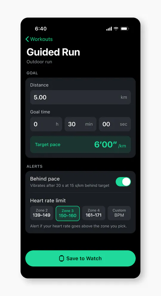
Runners think in finish times, so setup asks for a goal time and works out the pace.
Heart rate limit
From a number to zones
A bare “160 BPM” left runners guessing, so the limit became a choice of zones, with Zone 3 as the default.
Watch vs. phone
Editing on the watch, then not
Editing the goal on the watch blurred the split between devices, so setup stays on the phone.
Design
Final design
Six watch screens cover the run from start to finish, and two phone screens handle setup and review.
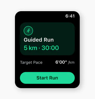
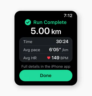
Ready to runLive run: pace first, at a glancePace alert: one tap, calm noticeHeart rate alert: strong double tapEasing off: pace alerts off for nowRun complete: full details on the phone
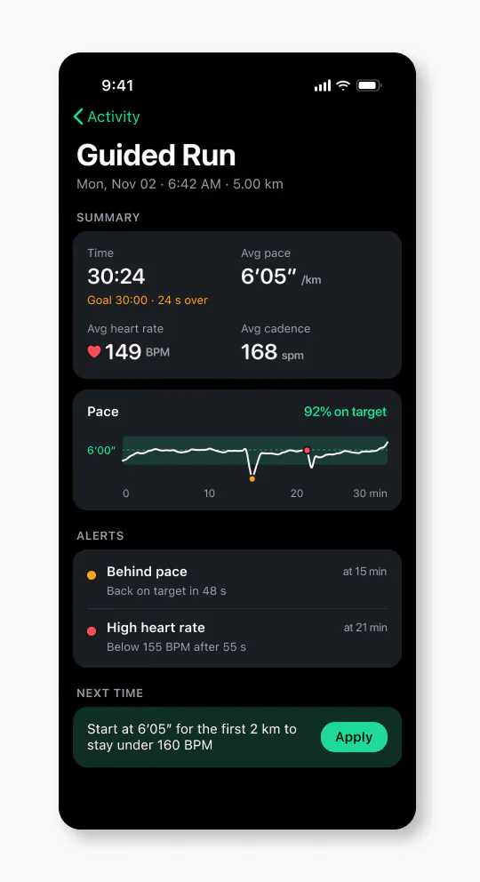
Phone setup: goal time and heart rate zonePhone review: pace, alerts and splits
Accessibility
Designed for motion
Glanceable
Big numbers, nothing under 12 pt, and high contrast on black for outdoor light.
Never color alone
Words, ring position and vibration carry the same message, so color-blind runners get it too.
No precise tapping
Alerts close by themselves, swipe areas cover half the screen, and buttons are large.
Feel it or hear it
One tap for pace, a strong double tap for heart rate, and short spoken cues with headphones, so runners know what happened without looking.
Hands-free stops
The run pauses and resumes on its own, for example at a traffic light.
Words, not signs
“30s/km behind” instead of “+30”, so the meaning never needs decoding.
Reflection
What I’d measure
What I’d watch, and what would tell me I was wrong.
Glance check
After one glance, can runners say why the watch vibrated and what to do? If not, the alert screens are doing too much.
Alerts per run
If runners regularly get more than one or two pace alerts, the thresholds are too tight.
Pace alerts turned off
If many runners switch pace alerts off, they feel like nagging, not coaching.
Time on target
If guidance works, time on target should rise over a runner’s first few guided runs.
Next
Next steps
Test with runners on short real runs, not just at a desk, since glances and vibrations feel different in motion.
Tune the defaults (20 s, 15 s, 6′10″, 3 min) based on how often alerts actually fire.
Check that runners can tell the two vibrations apart without looking.
Test the audio cues and vibration patterns on real runs, with music playing.